IowaMedicine Magazine
My favorite part of graphic design has to be layout design. There is something about arranging type, images and whitespace that I find to be very soothing. As you can imagine, I was very excited when I was given the opportunity to redesign the IowaMedicine magazine. IowaMedicine has been around for over 100 years, and throughout those years it has undergone many editorial and stylistic changes.
The most recent design changes date as far back as 15 years ago, so it was more than time to give the magazine a design makeover. My goal was to give the magazine an updated look, while keeping its identity alive. I wanted people who have been receiving the magazine for over 20 years to still recognize the publication. This meant keeping some of the old elements, while also removing clutter and shifting some of the visual focus on certain pages.
The Cover
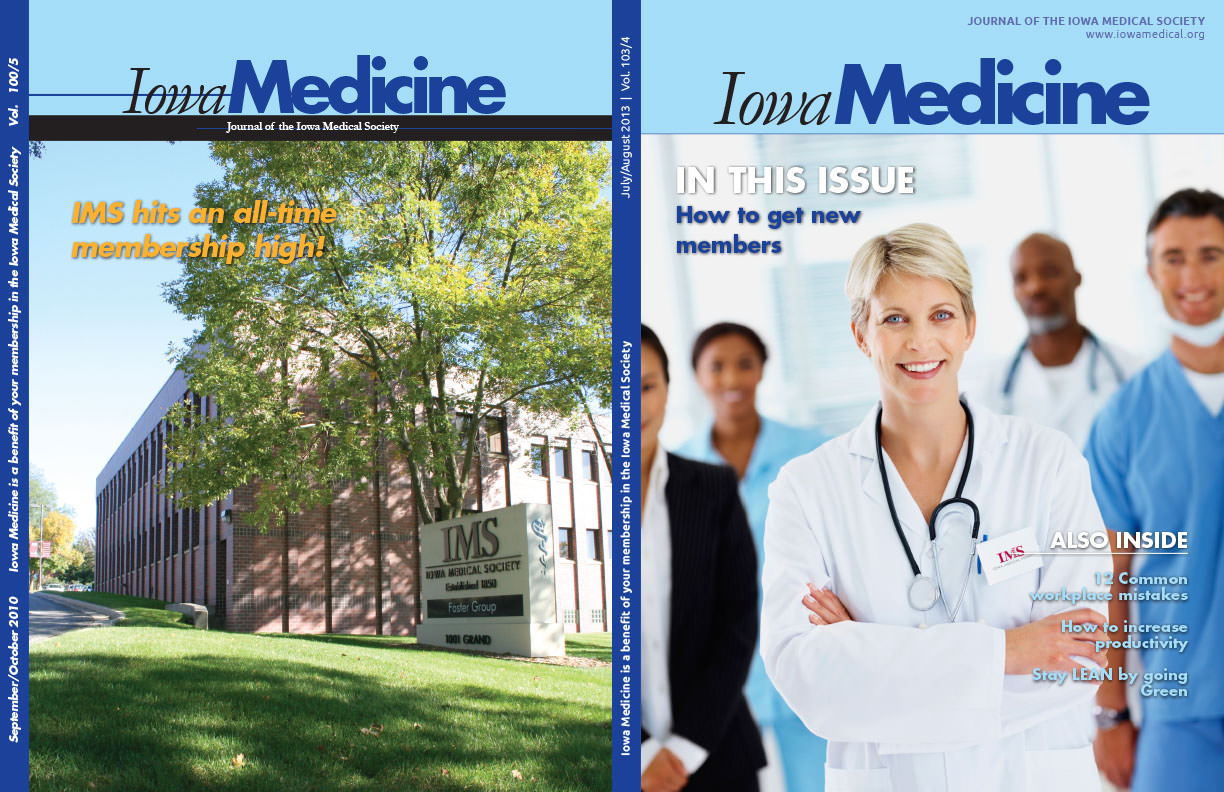
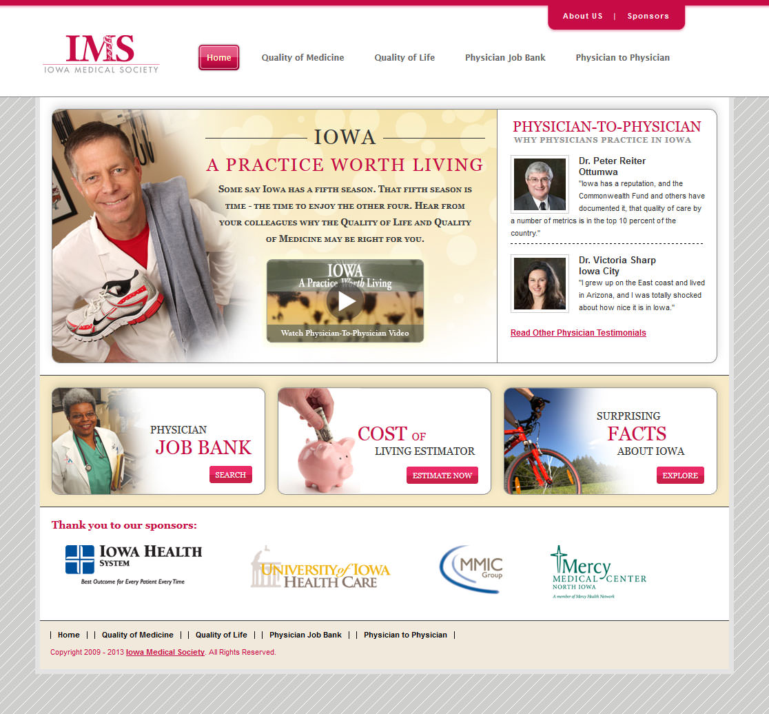
 Here is a comparison between the old cover and the new design that I created. As you can see, I kept the color and general layout the same so that the magazine is still very recognizable. However, there are some key differences between the two covers that make the new design much more effective.
The Masthead
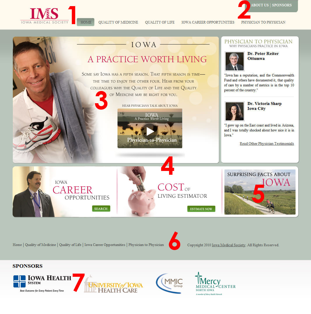
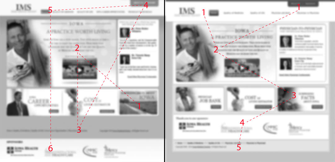
One of the main issues with the old design is the cluttered masthead. There is a lot of noise going on up there, yet very little is being said. The title of the magazine is being overpowered by the black bar below and the unnecessary strikethrough on the word Iowa. Furthermore, the branding of this magazine as a publication of the Iowa Medical Society is being shortchanged, by being hidden in the black bar and once again obscured by a line going through it.
I decided to ditch the black bar and move Journal of the Iowa Medical Society to the very top. I was also able to add the website address of the company on the cover, while still making the masthead look less cluttered. So we’re saying more with less! The key here is that IowaMedicine stands out more because it has more room to breathe and does not have to compete with anything else. I also like having the website of the company on the cover, not only because it helps brand the company and drive traffic to the website, but also because the magazine itself is also available on the website in a digital format.
The Spine
The next area I tackled was the blue spine on the left. One of the biggest mistakes I see young designers make is that they want to bold everything. This is a classic case of everything needs to stand out and by bolding everything, nothing ends up standing out. I also disliked the fact that the date was separated from the volume number as they are a natural match.
The solution to these problems is very simple in fact; move the date and volume to the right which puts it next to the masthead. Since the masthead has a lot of whitespace around it, and is no longer cluttered, we can give the date and volume a regular font thickness. Even with this delicate type, it is still easy to read and immediately makes sense even if you are just glancing at the cover.
Next, since this magazine is a benefit for members this is the part I really wanted to stand out. Not only does this put emphasis on the fact that the members are receiving this magazine for free, but once again we’re branding this as something produced by the Iowa Medical Society. A third reason for having this text in bold, is that it will stand next to the main cover image, so it will have more to compete against.
Cover Image
Now that we have the top done and the side done, we have a nice framework to work with for the main image of the magazine. By having a clean masthead and clean spine, we can be more creative with the cover. This allows us to use more involved images as well as add more interest to the magazine by highlighting not only the feature article but also some of the other content inside.
I’ve kept the main article title at the top and added a secondary Also Inside section in the bottom right hand corner. This balances out the page and further frames the cover image giving it more impact and importance. I had to keep the bottom left corner empty because that is where the mailing label is affixed.
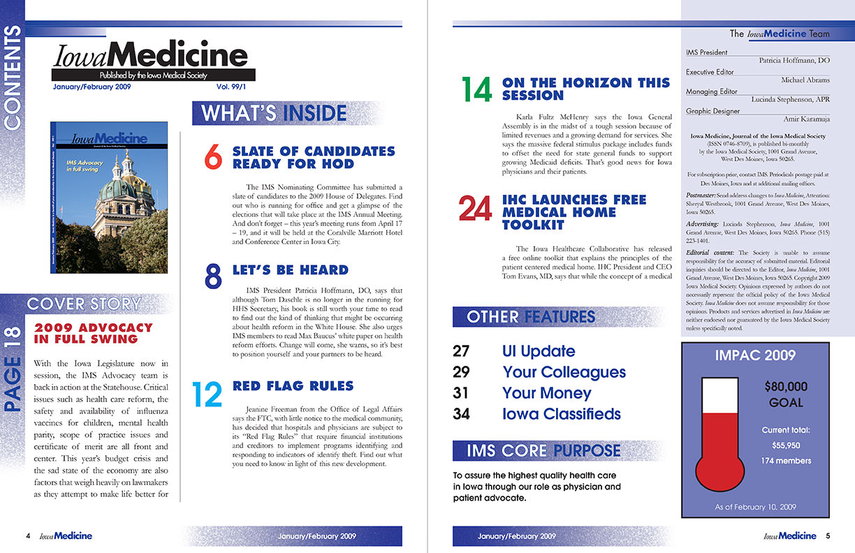
Table of contents
 The old table of contents lacks hierarchy and is cluttered. Everything seems to have the same weight and there is no discernible path for the reader’s eyes to follow. This detracts from the actual content and reduces the likelihood of people taking the time to read the short paragraphs explaining the articles, which in turn reduces the likelihood of the magazine being read at all.
These pages also make use of a lot of colors without actually getting any value from them. What I mean by that is that they were using at least 6 distinct colors, yet they all seem to blend together in a weird and unattractive mesh. It’s hard to discern at a glance what is a title of an article and what is section subhead despite all the colors used.
To remedy all of these problems I had to take a heavy handed approach to these pages. Simply changing the font type or colors would not have been enough. I had to change the location of sections, colors and size of subheads and the general flow of content.
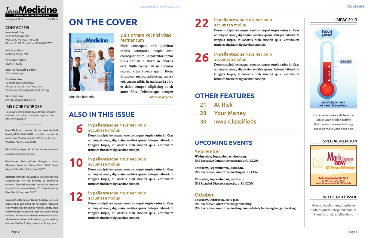
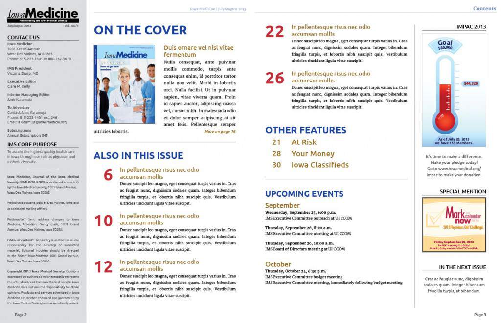 As you can see in the final product I was once again able to add more content to the pages, while still making them look more organized. I’ve moved all static information into a dedicated gray left hand column. The subtle gray takes it out of focus thus no longer distracting the reader from the main content.
Now the primary focus, upon opening the table of contents, is on the cover story, followed by a few other important articles below. By establishing clear colors for the sections and titles of the articles it is very easy for the reader to figure out what to look at for information, and how to find the area they are most interested in. The subtle changes in font size help guide the eye from left top, to left bottom, back to right top and finishing at the right bottom of the two page spread.
To help further with page balance, I’ve added some of the more styled elements like the save the date and thermometer into its own dedicated bar on the right side of the page. Now both pages look symmetrical, have plenty of white space and a coherent hierarchy.
Article Page
 The article pages did not have as many problems as the other pages, but they still needed freshening up. One of my biggest pet peeves is placing too much emphasis on static content that the reader does not really have much use for. In this case, the content section as well as the magazine name and date are overpowering the actual article. By this time, the reader already knows what he or she is reading and they know what month it is.
Once we’ve engaged the reader by having a well-designed cover, and we’ve guided him to an article via a well-structured table of contents, we don’t want to waste his time by shoving our magazine name and useless dates in his face. We want to deliver the content cleanly and efficiently.
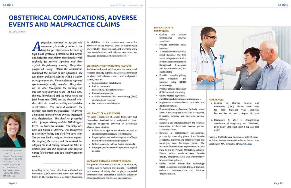 With that in mind, during the redesign I put most of the focus on the title of the article and the author; this gives the article importance and credibility. I’ve moved the section title to the top of the page, so they can be found easily when thumbing through the magazine, yet they are small and light enough as to not to interfere with the title of the article.
Furthermore, I’ve reduced the display of IowaMedicine and the date to only the left hand side of every spread in the magazine. This way we still get the branding without overpowering the page and without distracting the reader. Next I’ve also added the word Page and bolded the numbers in the bottom corners so that once again it is easier for the reader to thumb through and quickly find what they are looking for.
As a final step I established clear style guides for the articles such as having a distinct color and uppercase formatting for sub titles, as well as bold type and a blue color for all web and email addresses. These little tweaks help the reader make their way through lengthy articles by providing rest points for the eyes.
Conclusion
If you’ve made it to the end of this article, congratulations! As you can tell there is a lot to cover when it comes to layouts, which is why I love working on them. Having a good understanding of what makes a good layout and how to use whitespace correctly is absolutely crucial for all areas of design, but they really come out to shine when you are laying out a magazine.


