


IMS Website
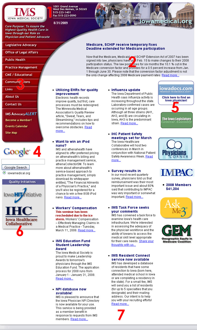 Here is a quick snapshot of the old IMS website homepage. Click on the thumbnail to open a larger version of the image in a new window so you can follow along as I describe the issues with the website.
From the start you can see that the design itself is not very appealing. However, for me the lack of functionality was a much larger issue. I am no fan of overdesigned websites that make it hard to navigate, find content or are sluggish to load due to the use of flash or a lot of unnecessary images.
Main Issues
Not cross browser/platform friendly
As you can see the feature story (#2) does not sit neatly inside the blue shaded area. It looks fine in Internet Explorer, however, breaks apart in pretty much any other browser.
Lack of hierarchy
What are you supposed to look at first? Everything is about the same size with the same amount of emphasis making it hard to focus on anything. Remember, if you bold everything nothing stands out.
Poor menus
You cannot see how the menus functioned from this image; however, suffice it to say that they used a lot of JavaScript. Fly-out menus, with multiple levels, were used which made it hard to click on a link, as they would close up as soon as your mouse deviated off of the very small hover area. Worst of all, the menus were basically unusable on a mobile device.
Furthermore, the menus were poorly organized; sections with the same name would show up in multiple locations confusing the user in their search for content.
Website not centered horizontally
This is one of my pet peeves, and not everyone might necessarily agree, however, I am a big proponent of centering pages horizontally. I myself use a widescreen monitor, as more and more people are, and having to look to the left to look at a webpage is quite a nuisance. Especially if I plan on spending a lot of time on a page reading, it must be centered!
As you can see by the items mentioned above, this website had quite a few challenges to overcome, but there was more. Here is a quick breakdown of what else needed to be fixed:
- Text as image: As frustrating as it gets! The company’s address and phone number are displayed as images; which means you cannot highlight and copy/paste the information.
- Feature story does not stick out: The lead story is supposed to be the one to draw the most attention as it displays the most important issue. This does not happen here, the story gets lost with the rest of the design.
- Poor Menus: As mentioned before, poorly designed menus and they use images for text to boot.
- Google does not blend: The search box sticks out like a sore thumb; no CSS has been applied to make the design conform to the rest of the page.
- Links overpower the page: The links on the right hand side are unorganized, have no consistent style and are in general too large.
- More links: Again same problem as with number 5. And why are these on the left-hand side all of a sudden?
- No clear footer: Footers are necessary to show the user that a page has ended. Often pages that do not load fully will show up without a footer; however, this one is designed without one!
Solution: The Redesign
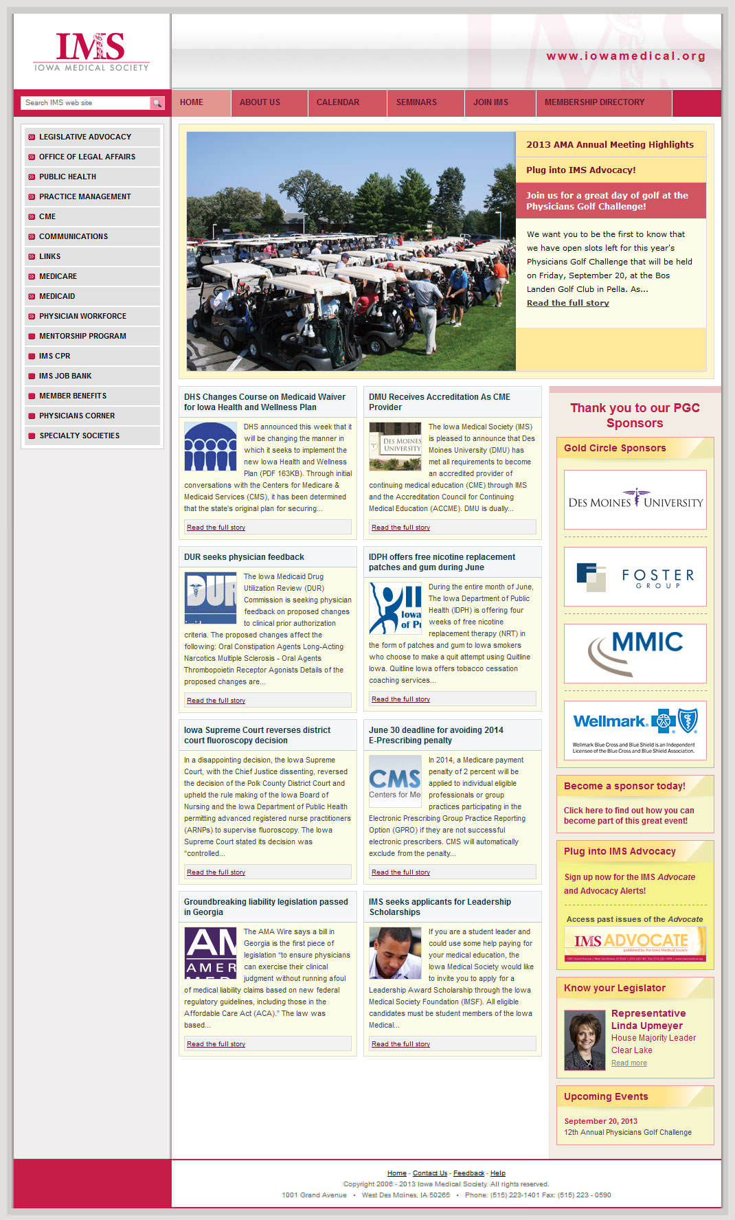 There you have it! Those were the main issues I was confronted with when I tackled the IMS website. All of the issues I mentioned were fixed in the redesign and the feedback we received from users was overwhelmingly positive. Our daily unique visitors shot up from 2,000/day to 10,000/day in less than two months.
As you can see the menu is now user friendly and cross platform compatible, the pages have a clear hierarchy now as well as interactive features, such as comments and quick polls. I have also made it a point to highlight important areas of the website with a top menu making it easy for users to find the most requested sections.