


CPR Website
As designers we like nothing more than to be given a problem and then given the freedom to provide a creative solution to that problem. A brand new identity, a brand new website, brand new packaging design…that is what we like to take on, but that is not how it always works. Some projects start out like this: “We like what we currently have, could you just update it…and make it look a little better?”
I find that these kinds of projects are harder to take on because the client will often be emotionally invested in their current design. More likely than not they have been involved in the initial design and therefore feel you are in a sense “attacking their work” when you critique their current design. When you have a project like this the key is not to get frustrated; instead, keep your and the client’s common goal in mind. You are both trying to improve on the current design in order to make the final product stand out against the competition and as a result make the business more profitable.
I was recently presented with just such a challenge. A web design makeover that had to rely heavily on what had been done previously. This wasn’t a case of “We really like this design…we just want it updated” but instead it had to do with the fact that this was a brand new project that had been unveiled and radically changing the look of the site so soon would not have been acceptable. So instead, I had to take what was there and improve on it. Get rid of the design flaws, keep some key design elements and at the same time make the site more user-friendly and visually appealing!
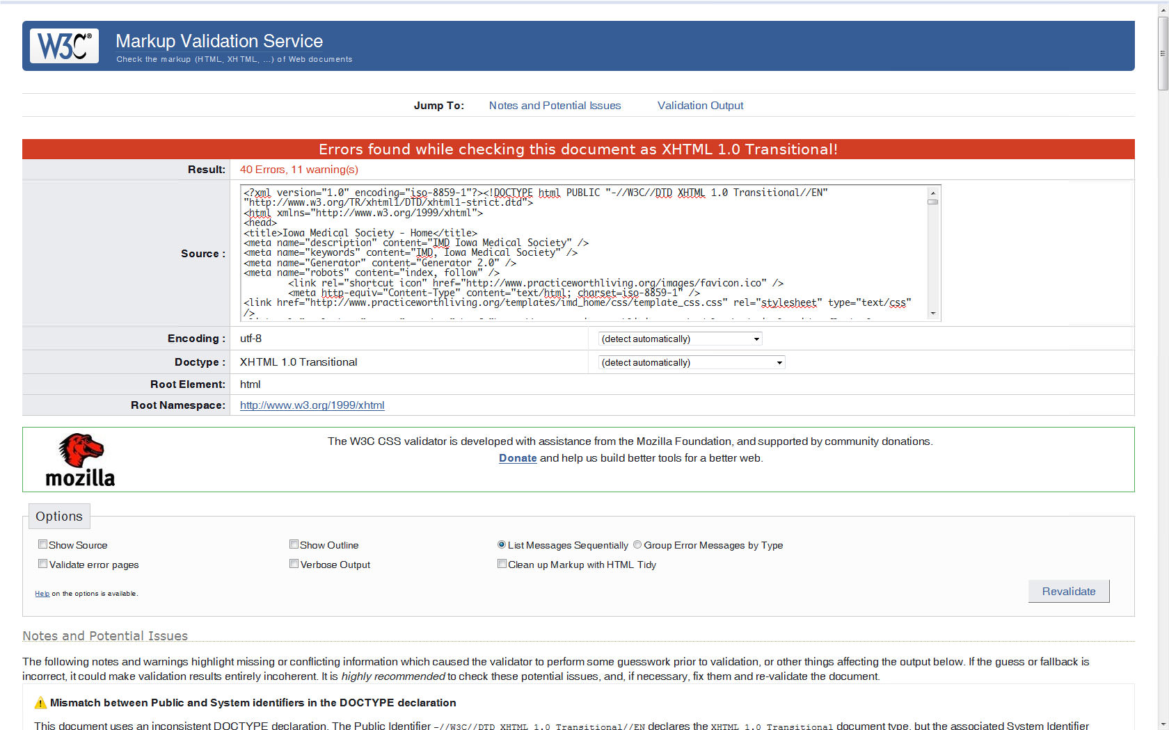
My troubles began when I ran the current website through the W3C Markup Validation Service and got this (40 Errors , 11 warnings). For the purpose of this analysis I will not focus on the technical flaws of the website and instead focus on the pitfalls of the design. In my re-coding I obviously made sure the site would validate and I got rid all the cross browser issues.
Back to the design…
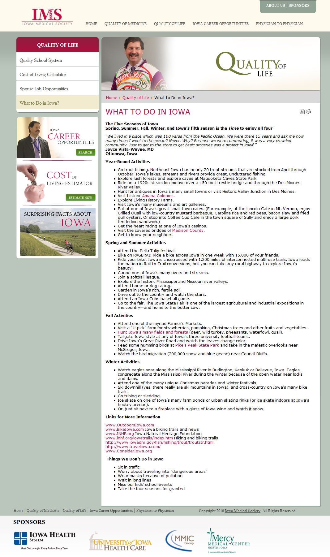
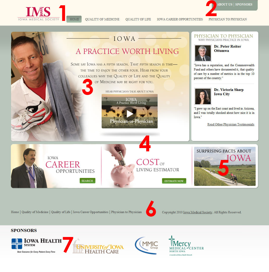 Here is a screenshot of the initial design that I had to work with. I’ve also highlighted some of the key problems with the design so you can follow along as I tackle them one by one.
As you look at the first screenshot you will see that the homepage lacks unity, good contrast and generally just feels unpolished. The color scheme is bland and makes almost all of the text hard to read. The subpage isn’t much better; it also suffers from the same issues and in addition has very poorly formatted text.
Main Issues
Not cross browser/platform friendly
I’ve briefly mentioned this before so I won’t spend too much time on it, but the entire site was just very poorly coded. It wasn’t cross browser compatible and didn’t keep accessibility in mind (more on this later).
Dark color scheme
This website is supposed to attract medical professionals to practice in Iowa. Instead of seeing clean, bright and inviting colors, we get a muddied dark gray along with some shades of green. These colors are not in line with what people think of when they think about medicine (white, clean, organized, etc.) Colors are used to set the mood on a site and can help you convey a comprehensive theme along with your content. You wouldn’t want a heavy metal band website to be bright pink and yellow, any more than you would want a website about medicine to be dark and gray. Always keep your audience and theme in mind when choosing colors for your website.
Lack of hierarchy
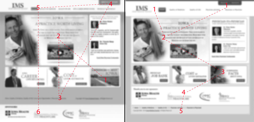
Poor hierarchy is the most common mistake I see on websites. People get caught up and enamored with every section of their design and forget to provide a coherent visual path for their users to follow. Always remember that not everything is equally important and it is your job as a designer to prioritize sections so the user can easily figure out where to go next. A good way to test if you have good hierarchy is the gray-blur test. Take your design, convert it to grayscale and blur it by 2-4 pixels and see if you can still figure out which sections are the most important ones. See example.
Accessibility
A website with accessibility is a site that can be used by people who have disabilities. More specifically, accessibility means that people with disabilities can perceive, understand and navigate the site. You may not be able to tell from the screenshot, but the front page has about 2 sentences worth of actual text. The rest are images which screen readers cannot view and search engines cannot crawl. Remember, if your site is not accessible you are alienating a large user base and are also making your website raking drop because bots cannot crawl your site and find keywords in your content. When you do have to use images, make sure to always include alt and title tags that are descriptive.
Here is a quick overview of some of the other issues:
- The menu uses dark gray text on a gray background. It’s hard to read, unattractive and just feels unfinished. The menu needs to be clean, bold and organized so the user knows where he’s going and where he’s been.
- These two menu items don’t even look like buttons, nor do they look like something that is interactive.
- The figure overpowers the text. This website is about getting doctors to Iowa, not about that specific doctor. Another hierarchy issue.
- All the sections seemed to be disjointed and lack unity. The page seems to be falling apart rather than being held together by a strong design.
- The footer is hard to read and on lower resolutions looks like it’s the end of the page. Some people never get to see the sponsors.
- Sponsors are important! They gave good money for this project and deserve better treatment than just being slapped at the end of the page without any integration with the rest of the content.
Solution: The Redesign
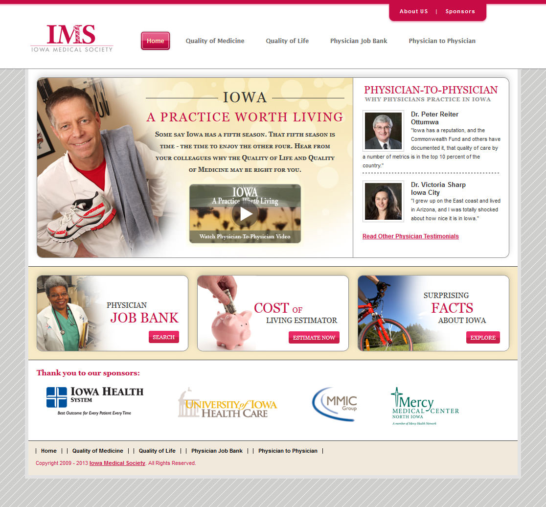 Having looked at all the issues with the design it came time for the redesign. As I said before the new design needed to be based on the original while at the same time fix all of the issues that I mentioned.
As you can see I’ve given the menu a much needed overhaul and combined some of the sections together to give them more impact and provide a clear hierarchy. I’ve also moved the sponsor above the footer because the footer denotes the end of the page, and the sponsors should be seen before that. Also note that the page is brighter and cleaner than before giving it an inviting and professional look.